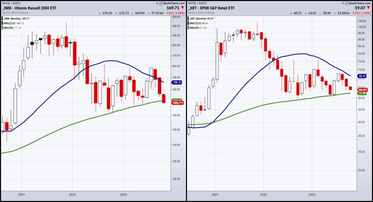
Yesterday, we covered the 80-month moving average in small caps and retail.
Today, I did several interviews — some already out (BNN Bloomberg), others out soon (Financial Sense with Jim Pupluva), and the one that you’ll find on YouTube later today with Real Vision.
We chose this one to feature as it is 30 minutes long and covers the breadth of pretty much everything:
Bonds — Yields, Corporate DebtDollar/YenEconomic Modern FamilyCommodity Futures — Oil, Gold, Food, Base MetalsGrowth Stocks vs. Small CapsRecession, soft landing, stagflationVolatilityBitcoin and alt coins
Please have a listen! The clip will be available on the MarketGauge YouTube channel soon.
This is for educational purposes only. Trading comes with risk.
For more detailed trading information about our blended models, tools and trader education courses, contact Rob Quinn, our Chief Strategy Consultant, to learn more.
If you find it difficult to execute the MarketGauge strategies or would like to explore how we can do it for you, please email Ben Scheibe at Benny@MGAMLLC.com.
“I grew my money tree and so can you!” – Mish Schneider
Get your copy of Plant Your Money Tree: A Guide to Growing Your Wealth and a special bonus here.
Follow Mish on Twitter @marketminute for stock picks and more. Follow Mish on Instagram (mishschneider) for daily morning videos. To see updated media clips, click here.
Mish in the Media
Mish presents a warning in this appearance on BNN Bloomberg’s Opening Bell — before loading up seasonality trades or growth stocks, watch the “inside” sectors of the US economy.
Watch Mish and Nicole Petallides discuss how pros and cons working in tandem, plus why commodities are still a thing, in this video from Schwab.
Mish talks TSLA in this video from Business First AM.
See Mish argue investors could jump into mega-tech over value and explain why she is keeping an eye on WTI prices on BNN Bloomberg’s Opening Bell.
Even as markets crumble, there are yet market opportunities to be found, as Mish discusses on Business First AM here.
Mish explains how she’s preparing for the next move in Equities and Commodities in this video with Benzinga’s team.
Mish talks about the head-and-shoulders top pattern for the S&P 500 in The Final Bar.
Mish covers sectors from the Economic Family, oil, and risk in this Yahoo! Finance video.
Mish shares why the most important ETFs to watch are Retailers (XRT) and Small Caps (IWM) in this appearance on the Thursday, September 20 edition of StockCharts TV’s The Final Bar with David Keller, and also explains MarketGauge’s latest plugin on the StockCharts ACP platform. Mish’s interview begins at 19:53.
Mish covers 7 stocks that are ripe for the picking on the Wednesday, September 20 edition of StockCharts TV’s Your Daily Five, and she gives you actionable levels to watch.
Take a look at this analysis of StockCharts.com’s Charting Forward from Jayanthi Gopalkrishnan, which breaks down Mish’s conversation with three other charting experts about the state of the market in Q3 and beyond.
Mish was interviewed by Kitco News for the article “Oil Prices Hit Nearly One-Year High as it Marches Towards $100”, available to read here.
Mish covers short term trading in DAX, OIL, NASDAQ, GOLD, and GAS in this second part of her appearance on CMC Markets.
Mish talks Coinbase in this video from Business First AM!
Mish looks at some sectors from the economic family, oil, and risk in this appearance on Yahoo Finance!
Mish covers oil, gold, gas and the dollar in this CMC Markets video.
In this appearance on Business First AM, Mish explains why she’s recommending TEVA, an Israeli pharmaceutical company outperforming the market-action plan.
As the stock market tries to shake off a slow summer, Mish joins Investing with IBD to explain how she avoids analysis paralysis using the six market phases and the economic modern family. This edition of the podcast takes a look at the warnings, the pockets of strength, and how to see the bigger picture.
Mish was the special guest in this edition of Traders Edge, hosted by Jim Iuorio and Bobby Iaccino!
In this Q3 edition of StockCharts TV’s Charting Forward 2023, Mish joins a panel run by David Keller and featuring Julius de Kempenaer (RRG Research & StockCharts.com) and Tom Bowley (EarningsBeats). In this unstructured conversation, the group shares notes and charts to highlight what they see as important considerations in today’s market environment.
Coming Up:
October 5: Yahoo! Finance & Making Money with Charles Payne, Fox Business
October 12: Dale Pinkert, F.A.C.E.
October 26: Schwab and Yahoo! Finance at the NYSE
October 27: Live in-studio with Charles Payne, Fox Business
October 29-31: The Money Show
Weekly: Business First AM, CMC Markets
ETF Summary
S&P 500 (SPY): There are multiple timeframe support levels round 420-415.Russell 2000 (IWM): 170 area huge.Dow (DIA): 334 pivotal.Nasdaq (QQQ): 330 possible if can’t get back above 365.Regional Banks (KRE): 39.80 the July calendar range low.Semiconductors (SMH): 133 the 2000DMA with 147 pivotal resistance.Transportation (IYT): 237 resistance, 225 support.Biotechnology (IBB): 120-125 range.Retail (XRT): 57 key support; if can climb over 63, get bullish.
Mish Schneider
MarketGauge.com
Director of Trading Research and Education

