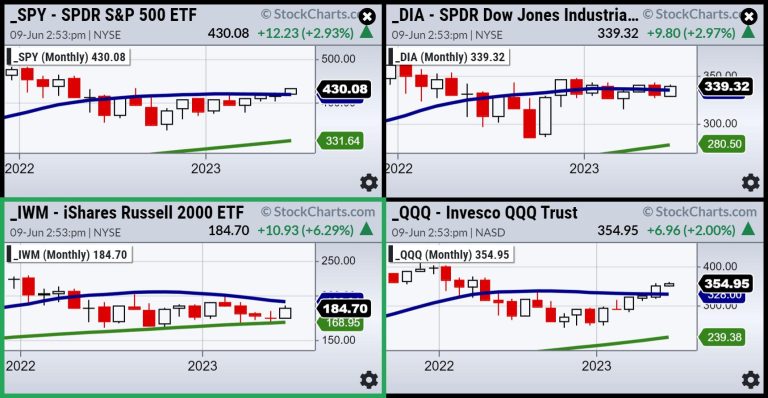
Looking at the monthly charts of the four major indices as we hit mid-June, all but the Russell 2000 are trading above their 23-month moving average. Thus far, this is in line with our prediction that, by the time IWM hits (if it does hit) 190-200 and the SPY hits 440, the top will be in.
First, the Russells have to clear their HUGE resistance at 1900. SPY has to take out the August 2022 highs and NASDAQ, well overbought, has to get above 370. Right now, with so much economic data coming up, we are finding it best not to be in a bullish or bearish camp. Rather, we like to think like a trader and not get too wedded to a bias.
Thus far, looking at some key ratios from our Big View product, we have stayed on the right side of the market. All signal risk on. The SPY is doing better than gold and outperforming the long bonds. Junk bonds are doing better than long bonds. Those ratios made it clear that the tech rally, long in the tooth, would attract retail money into the small caps, value stocks, retail sector, and some basic materials.
The first 5-6 months and this ongoing rally make alot of sense. As the market is forward thinking, investors saw the Fed slowing down rate hikes, inflation cooling, earnings better than expected, a mixed-yet-robust labor market, tech undervalued, and perhaps the worst over for economic contraction.
The big question now is what about the next 6 months-what will the market think the forecast is?
Here are the upcoming reports to look forward to this week.
Of course, the biggie is the Fed, but, regardless, we still believe inflation round 2 is coming. Recent weather threats (from storms to drought), Canadian fires, issues in the Panama Canal and the West Coast potential port strike could easily weaken the dollar and spike the commodities. Plus, there’s oil and OPEC; folks are thinking lower oil prices in store, but we know the Saudis want to control supply.
As for the Fed, our guess is they will pause for June. And they should. But even if they raise .25%, can they control supply chain issues and a persistent lack of certain raw materials?
Another feature is that the Treasury is about to buy a trillion dollars of short-term bills, announced this week and then completed on the 12th. The impact on fixed-income bond ETFs is what we are watching. The Government needs to raise money, and auctions are meant to get competitive pricing from buyers (retail and institutional). However, it all comes down to supply/demand.
For picks, please watch recent media links listed below.
For more detailed trading information about our blended models, tools and trader education courses, contact Rob Quinn, our Chief Strategy Consultant, to learn more.
“I grew my money tree and so can you!” – Mish Schneider
Get your copy of Plant Your Money Tree: A Guide to Growing Your Wealth and a special bonus here.
Follow Mish on Twitter @marketminute for stock picks and more. Follow Mish on Instagram (mishschneider) for daily morning videos. To see updated media clips, click here.
Mish in the Media
Mish and Charles talk inflation fears, the “wall of worry” and trading large-caps on Fox Business’ Making Money with Charles Payne.
The first 5 months of 2023 have been rallying on optimism going forward. Will that continue for the next few months? Mish digs into that question in this Twitter Spaces conversation with Wolf Financial.
Mish discusses impacts of weather, labor market and the FED on tap on Fox Business’ Coast to Coast with Neil Cavuto.
The US dollar rallied following a positive US jobs report last Friday, but could the Federal Reserve’s upcoming interest rate decision halt the greenback’s rise? Mish offers her views on USD/JPY, the S&P 500, and light crude oil futures on CMC Markets.
Mish talks GME (Gamestop) and more on Business First AM.
Where is the US economy actually heading? Rajeev Suri of Orios discusses this question and what trends suggest with Mish in this video.
Mish joins Rajeev Suri of Orios Venture partners to discuss the Fed, inflation, and buybacks in this video on LinkedIn.
In this episode of StockCharts TV’s ChartChats, Mish Schneider and TG Watkins (creator of the Moxie Indicator) sit down for a candid chat about working with other StockCharts contributors. Learn what TGs strategy for trading is, and how the the Moxie Indicator came to be. Mish shares her background and how she got started in the industry.
With Congress having reached a deal after months of debt ceiling talks, what direction could the US dollar move in, and what could this mean for the USD/JPY? Mish explores the market movements in this appearance on CMC Markets.
Mish joins Rajeev Suri of Orios Venture partners to discuss the trend toward a risk-on situation in this video on LinkedIn.
Mish weighs in on the overnight slump across the board on the benchmarks and where the momentum is heading on Singapore Breakfast, available on Spotify.
Mish explains how reversal patterns could come to the fore this week in this appearance on CMC Markets.
Mish joins Rajeev Suri of Orios Venture partners to discuss the possibility of economic stagflation in this video on LinkedIn.
Mish discusses how AI is being used to invest in this article for BNN Bloomberg.
Coming Up:
June 12: BNN Bloomberg Opening Bell + TD Ameritrade with Nicole Petallides
June 13: Daily Briefing on Real Vision
June 14: CMC Live Trading in London 1:30 ET
June 22: Forex Premarket Show with Dale Pinkert
June 23: Your Daily Five on StockCharts TV
ETF Summary
S&P 500 (SPY): August 2022 high 431.73, and of course 420 now key.Russell 2000 (IWM): 180-now must hold while still miles from its 23-month MA 193.Dow (DIA): 23-month MA 337 pivotal support now.Nasdaq (QQQ): Interesting inside day after yesterday’s drop. Makes 348.18 important for Fri. close.Regional Banks (KRE): 45.50 significant resistance. 44 mild support.Semiconductors (SMH): Inside here after yesterday’s decline making Wednesday low important.Transportation (IYT): 233.50 is significant resistance.Biotechnology (IBB): 121-135 range.Retail (XRT): 60 now support and 63 resistance.
Mish Schneider
MarketGauge.com
Director of Trading Research and Education

